Hi Team,
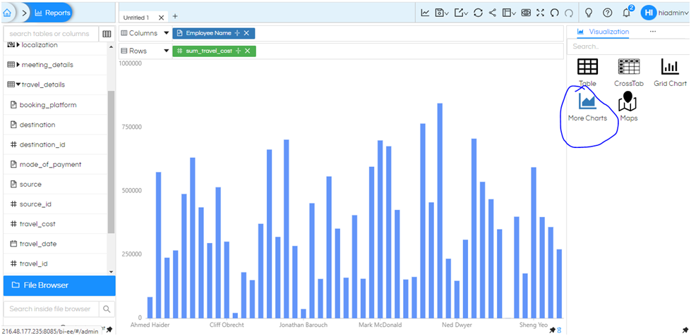
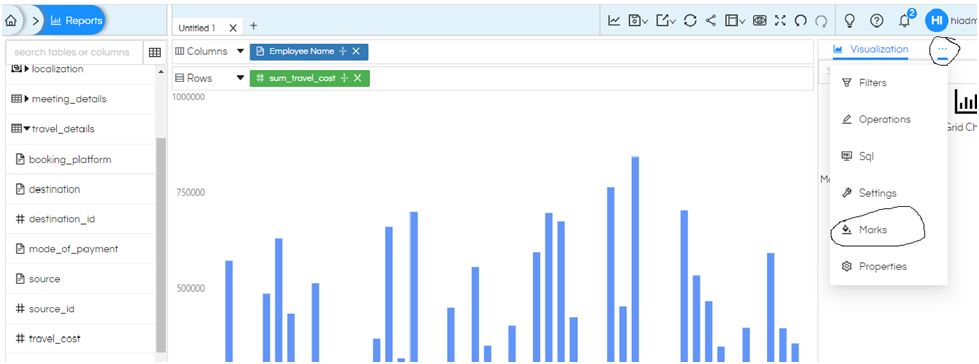
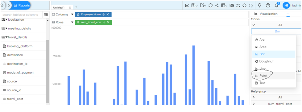
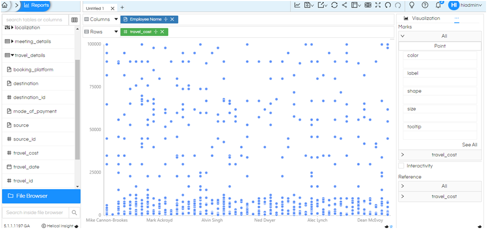
I am data scientist and i want to generate a visualization/scatter chart (NOT TABLE) without any aggregations and groupings ie. I want to see all RAW data and each of the data point to be listed in visualization. I am using Helical Insight 5.1 and when i am generating chart using GRID chart then even though i have not applied any group by, sum or any other aggregation then also chart is automatically taking grouping and not plotting every different data point. How to achieve visualization on RAW data so that i can see every data point and not aggregated ?
Thank You,
Netta.