Hello Harika,
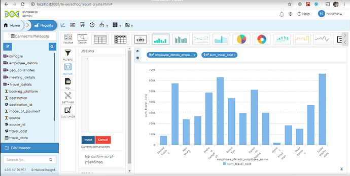
Hello. The charts have been designed in such a way that the number of legends on X axis dynamically decrease so that the readability is not affected. If there are a lot of bars and for all the name is shown the X axis will look cluttered and not very readable.
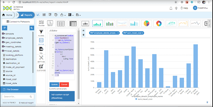
However if you would still like you can inject the below code in the JS Editor while creating the adhoc report, and then on the frontend it will show all the names.
hi_container.set("preExecution",function(c){
var viz_Options = c.get("viz_Options");

viz_Options.chartOptions["axis"] = {
x: {
tick: {
culling : false
}
}
},
c.set("viz_Options",viz_Options);
});
After putting the above code the chart will appear like below
Thank You
Team Helical


