The width of the screen works differently and this has been designed to ensure a responsive design for different screen width.
To understand this let’s take a little bit of deeper dive into the grid settings.
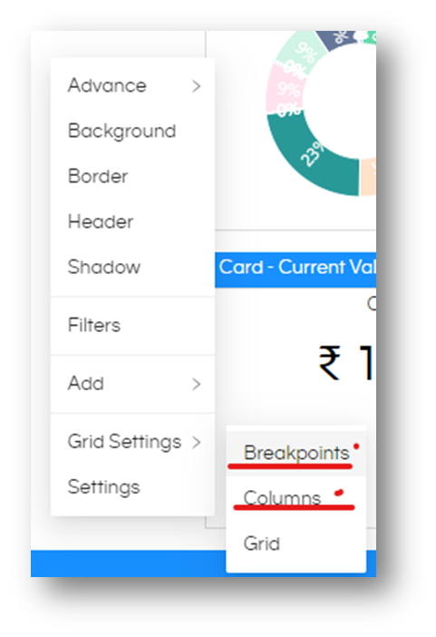
These two panels will go hand in hand. Grid Settings > Breakpoints and Grid Settings > Columns.
Column has default values like this
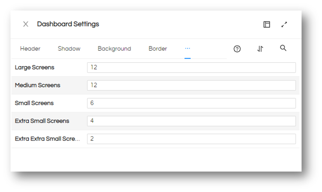
IF YOU WANT TO HAVE MORE GRANULAR CONTROL YOU CAN INCREASE THE NUMBER OF COLUMNS HERE, ACCORDINGLY THE MINIMUM WIDTH OF A PANEL CAN BE LESS ALSO. Basically above setting means how many columns a screen can have, so more the columns it can have that means each column width will be lesser allowing more granular control. However it is advisable to do this setting before you start creating the dashboard.
Detailed explanation:
Settings of Breakpoints and Columns can be found on Dashboard right-click context menu, (or via Dashboard settings button)
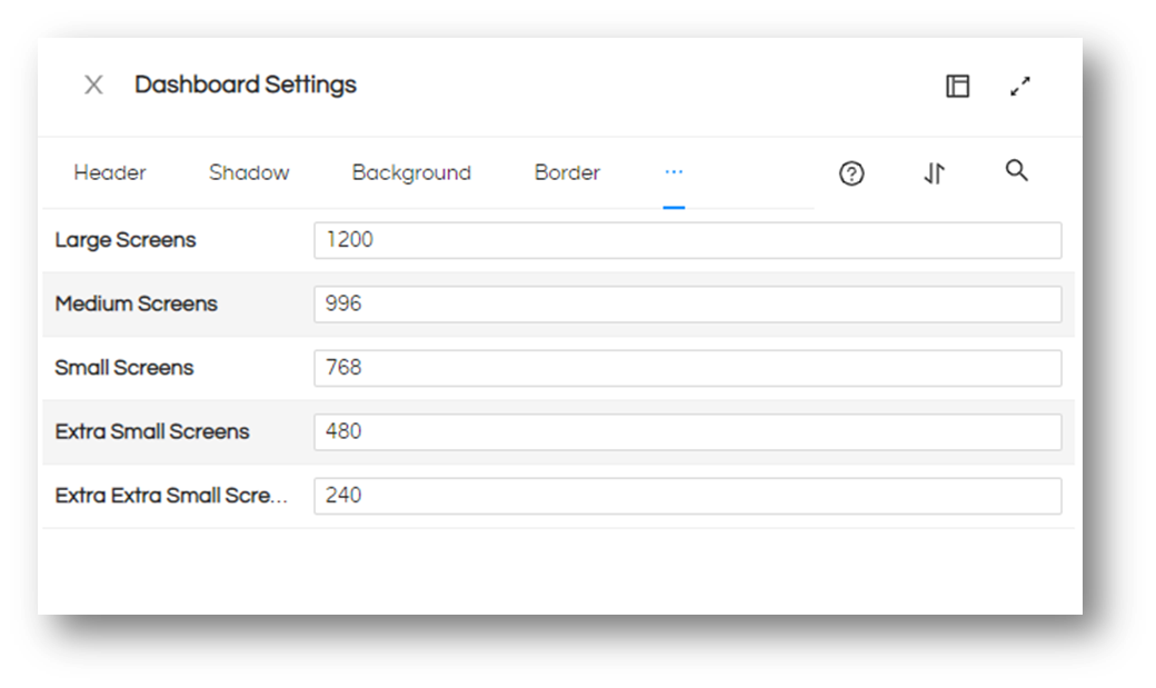
First let us understand the Breakpoints. This screen shows 5 different screen size options for you.
Based on what all screen do you foresee that the dashboard will be viewed. It could be small like a mobile phone, a medium size screen of a table a large screen of laptop or desktop, or probably a very large screen for an audience with a projector in a conference room. Depending on your needs you can define the screen sizes. (You only need to mention he width of the screen not the full dimension. For example for a screen 1200 X 1024 the width is 1200)
Default application settings are shown below
Any screen size in between the two ranges, will go to the higher range. Like a screen of 800 X 600 pixel will be considered as Medium screen defined as 996 pixels (as 800 is greater than 768 it cannot be a small screen)
Once you have identified the screen sizes your next step is to divide the screens into columns. Let us switch to the Columns panel to understand it. Default settings are shown below.
This is the place where your width of each report will be calculated from. If you are designing the dashboard, you most probably will be on screen larger than 1200 Pixels (which comes to Large Screen as per the default settings) You can use the columns screen to define the division of width into number of columns, in the default settings a screen of 1200 pixel (or higher) will be divided into 12 columns. Making each column as 100 pixel wide, making it as 1 unit of width for the dashboard.
With 100 pixel as a unit, you can have a report of 2 units (200 pixels) or 3 units (300 pixels), but not 250 pixels. Therefore, choose your screen division accordingly.
IF YOU WANT TO HAVE MORE GRANULAR CONTROL YOU CAN INCREASE THE NUMBER OF COLUMNS HERE, ACCORDINGLY THE MINIMUM WIDTH OF A PANEL CAN BE LESS ALSO.
This will get you precise control of report width for your screen. However, this is not the end.
Once the dashboard is designed and saved, there may be user with mobile device trying to view the dashboard. This is where the different screen sizes and divisions come into picture.
As this is a responsive design, the reports you keep aligned in one row, will go one below the other in smaller screen.
If you foresee the dashboard being used by users with a smaller screen, set the divisions accordingly.
This will make the reports reorganize as you want them to be.
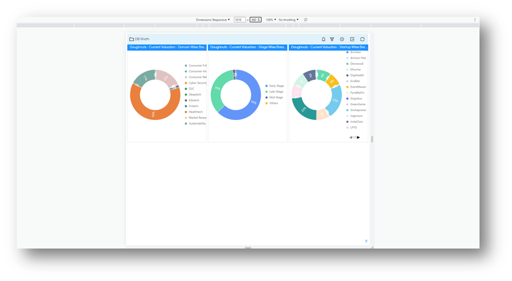
Let us understand with example. Assume that you have used default settings and placed 3 reports of 2 units each on a large screen next to each other. The screen is divided into 12 columns and each report is 4 units (= 400 pixel)
When this goes to Medium screen (still with 12 columns) the screen will keep the 12 column layout and reduce the width (in pixel) for each report
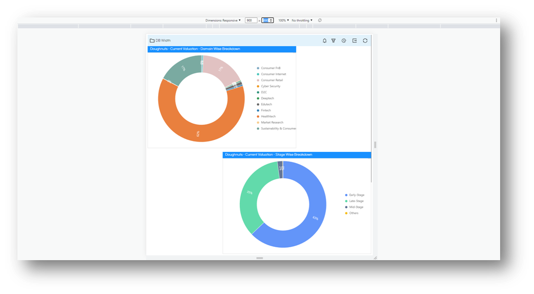
If you go any smaller than medium screen the screen will change the layout and now place the reports one below the other for small screen which has only 6 columns of width with each report occupying 4 columns (and 2 columns will be blank.)
Hope this clarifies how the responsive design is implemented on dashboard. And how the dashboard layout changes based on screen size. With a little bit of practice you can design a pleasing dashboards not only for a single screen but for all the screens that you anticipate your users to use.
Good luck.
Thank You,
Helical Insight.
