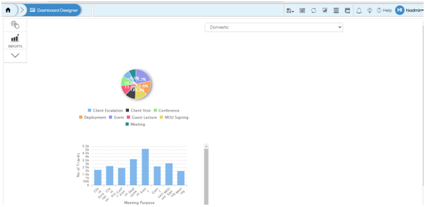
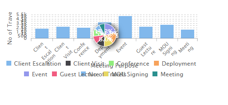
This can be achieved by using the Grouping and Overlay feature of the dashboard designer. We would be putting both the reports in within a single group on top of each other, and then a small code which will identify the value of the input parameter and based on that it will hide one report and show other report. The same concept can be extended
Step 1: Create the 2 different reports with the filters and save it.
Step 2: On the dashboard designer, place both the reports (pie and bar chart). Add the filter to the dashboard and add listeners to both the charts.

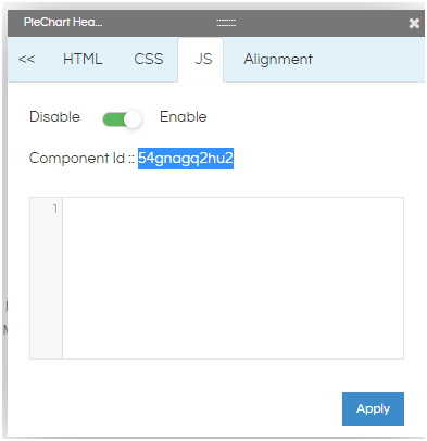
Step 3: Note the div id of the charts on the dashboard. You can find the div id by right clicking on the chart and going to CSS/HTML/JS option. The component ID is the div id of the chart.

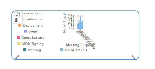
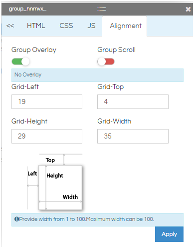
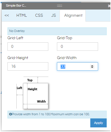
Step 4: Group the 2 charts together. Enable group overlay and align them on top of each other exactly using the alignment option. You can refer to our other blogs to learn how to do grouping and do alignment .


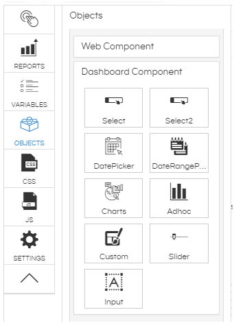
Step 5: Add a custom component on the dashboard.

Step 6: To this newly added component add listener for it to the filter on the dashboard by clicking on pencil icon of this (basically this component should be able to listen to the filter values). In the Custom Script section, put the JS for showing and hiding the chart based on filter value. An example is shown below. You can change the conditions based on your requirement. As the charts are overlapping on each other, only one chart will be seen at a time based on the filter value.
var dropdown= Dashboard.getVariable('travel_type');

console.log(dropdown);
if(dropdown=='Domestic'){
$("#luk3ui12snk").hide();
}else{

$("#luk3ui12snk").show();
}

if(dropdown=='International'){
$("#apdjt87qq6t").hide();
}else{

$("#apdjt87qq6t").show();
}

