Alignment of cards in dashboard

Hello Team Helical,
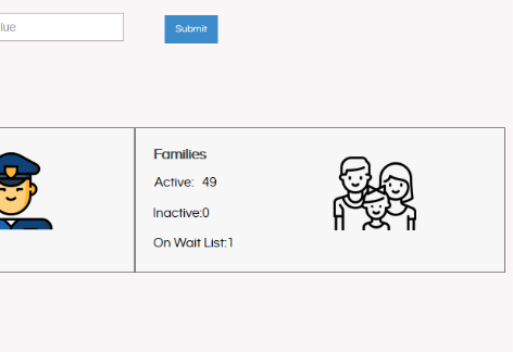
I am using Helical Insight 3.1 EE. I have created couple of cards, however when arranging these cards in dashboard designer the alignments is not coming properly. The texts of various cards are not coming one below another even though their x positions (via alignment) is the same. Please help with the above.

Thank You
Vetegoc.

1 Like

Hello Vetegoc,
In a dashboard designer whenever you are adding a card the values of the cards are always center aligned. Hence if the width of the cards are different, even though they start from the same place, the text will not be aligned one below the other since every card is of different width and the content present inside it is centre aligned.
You can add the below CSS in the dashboard and have all the cards as left-aligned, hence the texts will appear perfectly below one another.

#widget-title{
padding-left : 5px !important;
text-align: left !important;
}

Output
image_2020_01_03T11_46_01_010Z

Thank You
Team Helical.